More conversions through clean design
Article detail for :
Conversion Rate Optimization

Mega menu update
Before Fuel Made:

After Fuel Made:

Main changes:
- Cleaner categories
- Organization improved
- Money makers highlighted
Why we made these design updates:
- Since we moved everything into a single shop menu, the link style needed to be cleaner and more consistent. The original had competing styles and elements, so we made it less visually overwhelming.
- For desktop users, we kept the multi-color button style—but only for featured shop funnels (the best sellers).
- We used a type hierarchy to differentiate collection groups (bold, headline typeface) from product links (normal weight, body typeface) in columns.
Product description page update
Before Fuel Made:

After Fuel Made:

Main changes:
- More product visuals
- Strategic CTAs
- Value props showcased
- Cleaner look
- Focused buy box
- Accordion sections above the fold
Why we made these design updates:
- Galleries should give an indication of how many slides are available. Many brands use indicator dots, but these actually don’t perform as well as thumbnail images (especially on mobile). These give shoppers a better preview of what to expect.
- On the product form, the original design used a filled-in light gray for the default variant button (with a hollow blue outline for active). This was confusing for shoppers since the default made the product appear out of stock. Now, the buttons have the blue outline as default, with solid blue for active/selected.
- We cleaned up the quantity selector and type styles. Rather than floating ambiguously next to the cart button, the quantity input got anchored into the capsule style of the buttons, and the CTA was stretched to the full width of the form container so it’d be noticeable and easy to reach.
- Initially, key product information was in its own row, causing a large gap on the screen. We pulled this info into an accordion and pulled the section closer to the form (keeping relevant product info closer to the conversion point).
Now, customers of Franklin's Gourmet Popcorn can discover products they’re interested in while navigating the website with ease.
Next case study
Next case study
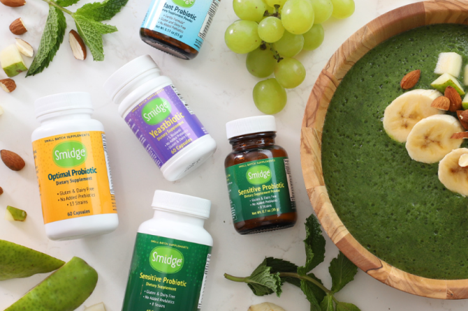
Smidge
Smidge’s 15% conversion rate improvement with a subtle change to PDPs.
Read Next Case Study