You may have heard the terms “style tiles,” “UI style guides,” and “brand guides” before interchangeably, but they couldn’t be more different.
We use UI style guides as part of our process here at Fuel Made. So if you’re wondering what these actually mean, and how they’re different from style tiles and brand guides, allow me to explain.
What is a brand guide?
Let's start with what most people are familiar with: brand guidelines.
These documents define your brand's personality.
Usually, this is in the form of a PDF document, or even a physical book. Brand guidelines should have a permanence to them — they provide a solid foundation to build out designs and campaigns.
So what goes into a brand guide? These documents shouldn’t be overly prescriptive because that leads to impermanence. Brand guidelines should last a long time, especially since they often take a long time to create as well.
These documents should be high-level, encompassing design, copywriting, and photography/video direction. Generally speaking, here's what they'll contain:
- Logo Rules
- Brand Colors
- Typography
- Photography Direction
- Voice & Tone
-
Accessibility Standards
All of these bits of information form the core base of a brand, and can be used to design anything from print ads, to digital billboards, to broadcast commercials.
How this applies to web design
Like other mediums, this creates the base of our design. It informs our design decisions, but doesn't make them for us.
Brand guide examples
Spotify Design & Branding Guidelines
Style tiles
Style tiles came into the scene in 2012, introduced by Samantha Warren in an article on A List Apart. Before these became standard practice in web design, designers used to jump from wireframes into detailed Photoshop comps. So if the client wasn't happy with the basic direction, it was a lot of work to go back to the drawing board for a new direction.
Style tiles move brand guidelines in the direction toward more concrete designs. By interpreting the brand guide basics, style tiles incorporate a mood board with abstract interface elements to begin to define a visual language for the site design. These are very loose, and can be replicated quickly to get a gut reaction and choose a direction to jump off from the brand guide.
Style tiles are also great for clients who don't have an existing brand yet, and in this instance, the UI design will help inform the brand guides. If this is the case, style tiles can show very different baselines for a project, which is helpful for narrowing down a wide array of directions.
Here are some examples from Fuel Made:

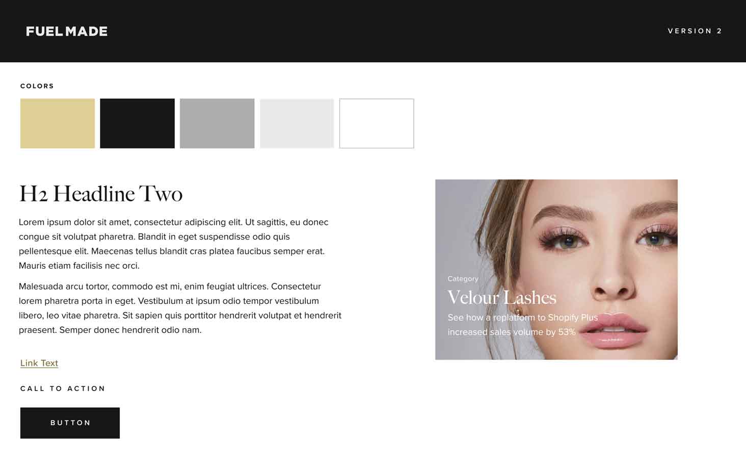
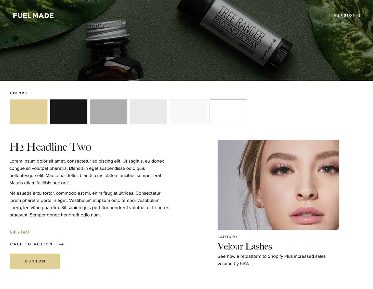
UI style guides
UI style guides take style tiles one step further. These mix the mood board elements in to show the intended look and feel of an interface design, but add more structural rules and interactive elements.
For example, they’ll show type scales and usage, highlight elements' hover, focus, or active states. It's still not as prescriptive of a template mockup or a design system document, but it's more buttoned up than a style tile.
Designers don't rehash the core principles from the brand guide in UI style guides, but we start to show the foundations for how the brand guide informs the interface design.
If you're working with us on a web project, this will typically be the first design deliverable you'll receive.
Note: UI Style Guides aren’t meant to be documentation in the same way a brand guide is. The web is a far more impermanent space, and UI designs are constantly evolving over time. Like style tiles, this document isn't meant to be a reference point, so much as an initial approval of the design direction.
After a site is live, there isn't much use for these design artifacts, and documentation for the digital implementation of a brand should move into a design system.

Brand guides, style tiles, and UI style guides are all used to define the brand usage—to different extents. The one you use will depend on your project, but this should clear up which one will work best for you.
