- The product page conveys your product’s value, shows customers how it solves a problem, and convinces them they need to have the awesome item you sell.
- A good, clean product page design will create a streamlined and personal user experience and an increased conversion rate.
- Everything from photography to product descriptions to live chat must be accounted for to maximize website traffic.
In an ever-changing digital landscape, conversion rate optimization (CRO) can feel like a never-ending battle.
After all, even if you do everything right, you can only expect to win the sale around 2.5 percent of the time.
The struggle is real.
We’ve dialed in on 9 ways to optimize your product page design, so you can come out on top to capture the most from your website visitors.
Quick Guide
- Invest In Photography
- Focus on the Details
- Crystal Clear Call-to-Action
- Chat with your shoppers
- Highlight your Videos and GIFS
- Leverage the Power of Product Reviews
- Communicate your Shipping and Return Policies
- Activate a Back in Stock App
- Use Exit-Intent Pop-ups to Capture Emails
- BONUS: Upsell, Upsell, Upsell! (and cross-sell, too!)
Invest in Photography
A picture is worth a thousand words. But in ecommerce, it’s worth so much more than that. Investing in photography is typically as important as investing in your website design.
More than 90% of consumers consider photos essential in the buying process - which isn’t too surprising when you consider 90% of information transmitted to our brain is visual!
Amazing product photos testify to the quality of your products and help your brand live up to customer expectations: a whopping 22% of returns are due to misleading pictures.
To make the most out of your photos, be sure they are a main focal point on your product page, and include multiple photos of the product. Alternate images will vary by industry, but a few to consider include:
- A close-up to show the texture, quality and craftsmanship
- An action shot of the product in use, so shoppers can imagine themselves using it
- A shot of the product in the packaging
- A shot that shows the size and scale of the product
As you can see, Luxy Hair uses multiple photos on their product page to give shoppers a good sense of what to expect from their hair extensions.

Focus on the Details
Along with photos, another crucial element of a good product page is the copy. Great copy answers questions shoppers have once they’ve gathered their first impression through imagery.
Since online shoppers don’t have the luxury of touching items before buying, they rely on the product description to fill in the blanks.
A great product description should answer key questions about your product, including:
- Ingredients (what it’s made from, where it’s sourced)
- Use instructions (e.g. how to apply)
- Size and weight of the product
- Color and scents available
- Battery life (if applicable)
- Cleaning & care instructions
A well thought-out, detailed product description not only describes the product, but explains to shoppers why they need it.
Right Channel Radios' product page design places the product description directly beside (& below) the photos, and thoroughly describes the product.

It’s important to keep your copy as clear and concise as possible; be sure to use bullet points and plain language so it’s easily digestible.
An added bonus is that brilliantly crafted, original product descriptions help Google and other search engines determine what you’re actually selling.
In other words, you’ll get a nice SEO boost.
Crystal Clear Call-to-Action
The Call-to-Action (CTA) on your product page needs to be as clear as day!
When looking at your current CTA, ask yourself these three main questions:
- Can customers easily find my CTA?
- Is it located high on the page?
- Does it stand out compared to other page elements?
On SpyGuy’s product page, the main element your eyes are drawn to is the “Add to Cart” button. It's bright, bold and positioned close to the key product information (price and reviews).

Shoppers shouldn’t have to scroll to find the CTA; they are conditioned to find it close to the product photos.
Chat with your Shoppers
When it comes to shopping online, customers have an endless amount of shops to choose from at the touch of their fingertips. If they can’t easily find the answers they’re looking for in a timely manner on your site, chances are they’ll leave.
Rather than hope your customers have all the information they need, why not ask them?
Talking directly to a customer via live chat helps replicate the same customer service experience shoppers expect when they enter a brick-and-mortar store. Live chat has been shown to increase conversion rates, while also encouraging return visitors.
It’s becoming increasingly popular too, with 72% of customers preferring it over email and phone support.
For shoppers who need a little extra push to place an order, live chat gives you an opportunity to engage. A simple, “Do you have any questions about this product?” goes a long way in building consumer trust. KinkyCurlyYaki knows this, and sends a note to visitors the moment they enter a product page.

It’s not only customers who are raving about live chat, either. Businesses are seeing the benefits too! Merchants can meet customer needs quicker than ever before, and are able to better identify consumer pain points.
There are quite a few live chat apps out there, but we do find that Intercom is a powerful third-party solution capable of handling our clients’ needs. However, there are lots of great options to choose from.
Highlight your Videos and GIFS
As we mentioned earlier, we’re visual creatures!
Why not bring your product to life with videos that educate shoppers about why they need your product? It’s an almost-guaranteed conversion booster, too! Visitors who view a product video are up to 85% more likely (on average) to buy it.
There are many different ways product videos can add value to your page. Two of the most popular types of videos include showing the product in-context and explaining how to use it.
For example, Luxy Hair knows that hair colour is extremely important to shoppers. As a result, they’ve created a video for each colour to help visitors visualize the extensions once they are clipped-in.

When creating a product video, here are a few common characteristics to keep in mind:
- Keep it short: 30 seconds is plenty!
- Tell a story: Call attention to key features and benefits that might not be easy to see in photos
- Be relatable: shoppers need to envision themselves using your product.
When it comes time to add videos to your product page, here are some basic best practices to follow:
- Be sure the “Play” button is visible and clear (including on any thumbnails).
- If applicable, choose a relevant and design-friendly thumbnail image.
Ensure the link is appropriately placed on the page, like how Luxy Hair does it:

Finally, keep mobile in mind! Video tends to do quite well on mobile, since shoppers are able to gain a quick overview of the product without needing to zoom-in on product photos or descriptions.
Leverage the Power of Product Reviews
One of the most powerful ways to persuade visitors is with the help of social proof. It’s not hard to see why: reviews help ease the minds of worried customers.
The numbers are telling, too: 90% of consumers read online reviews before visiting a store, and 67% of customers say online reviews influence their decision.
It's important to incorporate reviews into your product page design to truly harness their power. A good place to start is by adding a five-star review scale below the product price so visitors get a quick glance at it’s popularity, which Velour Lashes does well:

They also add full customer testimonials further down on the page, so shoppers get a true sense of what others’ think about the product.

Some more best practices for reviews:
- As we mention above, include a five-star scale so customers have a visual element to relate with.
- Add photos from customers to showcase the product in everyday life.
- Place well-known third-party badges and seals on the page to foster trust.
You’ll also need to dedicate some time to getting reviews. Here are a couple of ways to encourage them:
-
Email customers: set up an automated email to send to customers soon after they receive their product (and another one in a couple of weeks!) to ask them to write a product review.
- Offer a rewards program: many businesses offer a rewards program where customers can earn points for every review they make.
One of the top benefits to making reviews a priority is that the feedback you receive gives you an opportunity to improve your products!
There are many powerful apps that integrate with Shopify to showcase reviews on your website. We are really liking Stamped.io these days.
Communicate your Shipping and Return Policies
Telling visitors upfront what to expect from your shipping and return policies fosters trust and encourages them to act.
Let’s take a look at the data:
-
58% of shoppers will add items to their cart to qualify for free shipping if they reach a certain dollar amount, increasing your average order value along the way (Need help determining your shipping threshold? We dive into the metrics, right here).
- An inconvenient return policy deters 80% of shoppers.
If you make it clear what customers can expect from shipping and returns, they’ll be more likely to convert (especially if your offer is amazing, like Free Shipping & Returns!).
In addition, you’ll want to tell customers exactly when they can expect to receive the product in the mail. e.g. "Your item will arrive in 2-days or 2-weeks."
These policies are best communicated on a website banner or in the footer, but you should also consider adding them to your product page - it gives customers the little extra push they need to hit the “Purchase” button.
For example, Velour Lashes communicates their shipping and return policies directly on the product page, underneath their main call-to-action. They also use powerful language to evoke emotion, further persuading customers to purchase.

Linjer also does this well:

Activate a Back in Stock App
A back-in-stock app is a simple way to win sales you might have otherwise lost.
If an item is temporarily unavailable (for any reason), let customers request an email alert to inform them when it’s back on the shelves.
Peter Manning has a back-in-stock app activated on their store:

Our favorite app is conveniently named, you guessed it... Back in Stock!
Use Exit-Intent Pop ups to Capture Emails
Thanks to exit-intent pop ups (triggered by signs of leaving your store), you can capture emails from visitors who need a little extra push to convert.
With the right offer you can capture this exiting traffic in the hope of bringing them back to your store thanks to your email communication.
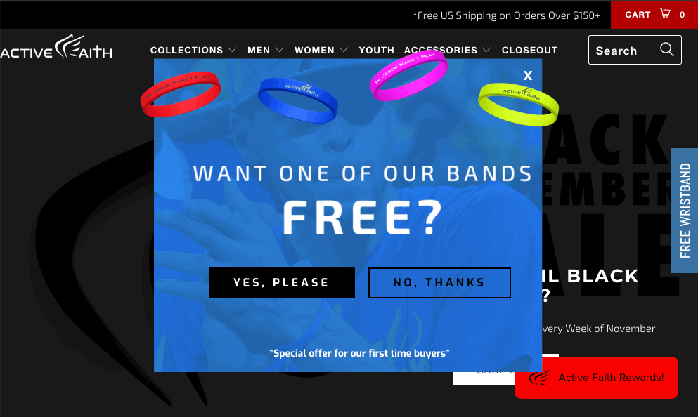
For example, Active Faith Sports uses an exit-intent pop up to offer a free wrist bracelet with their first purchase.
It's important to note that:
- You'll need a juicy offer in exchange for their email (such as a discount or promotion).
- Giving away a promotion via email means new subscribers look for you in their inbox and will open the first email. This increases chances of landing in their inbox in the future.
Once you have their email, the relationship-building can begin!
Add these emails to a Welcome Sequence and you're likely to see an increase in your conversion rate. On average, Klaviyo welcome sequences convert around 2% (ours see conversion rates anywhere between 9-13%!).
A good Welcome Sequence takes the (potential) customer through a journey that fosters trust and encourages them to engage with your brand.
Here are some additional tips to create a Welcome Sequence that converts:
-
Make your offer time sensitive: This creates a sense of urgency and gives you an excuse to appear in their inbox with offer reminders.
-
Hit them while they’re hot: If you’re giving a discount, send it immediately. If not, send a Welcome Email as soon as they subscribe.
-
High-value content: Send valuable information so readers are encouraged and trained to open your emails. Introduce your brand so they understand what you’re about. Help the customer make a decision by explaining your product to make it easy for them to place a first order.
-
Focus: Touch on one topic at a time in each email so you don’t overwhelm your readers. Don’t be shy to send up to 5 emails over a week long period, as long as each email has a clear goal and all of them together take the customer through a logical relationship-building journey.
- Discount ladders: If your first offer didn’t lead to a sale, consider adding discount ladders over time.
The real beauty of a Welcome Sequence is in it's automation - meaning you set it up once and it'll continue to work again and again without you lifting a finger.
BONUS: Upsell, Upsell, Upsell! (and cross-sell, too!)
Don't neglect offering upsells and cross-sells on your product page. While this one doesn't necessarily impact your conversion rate, it's worth mentioning.
When done successfully you’ll see an increase in average order value, a better profit margin, and a bump in customer satisfaction.
After all, it’s much easier selling to an existing customer.
These techniques are another way to improve the level of personalization that customers now expect when online shopping.
To upsell and cross-sell on your product page, place the feed below product videos and other high-value content. Your goal is to upgrade the item, or showing them additional options available.
Horne adds this section right below the product details:

Here are some other tips to keep in mind:
-
Choose the right upsell or cross-sell: Be selective, thoughtful and appropriate, and consider doing both. For example: a popular upsell might be a stainless steel version of an appliance, while a popular cross-sell might be bundled offers, extended warranty or service upgrades.
- Keep price in mind: If your customers are searching for $50 products, chances are you won’t see much of a boost if you show them additional items in the $150 range.
Be sure to leverage your copy to sell the benefits of the upsell or cross-sell. You want to sound honest and helpful to customers, not annoying.
Finally, Don't Forget About Testing
When changing elements on your product page to improve conversion rate, an A/B test may be helpful to ensure that you have indeed improved things.
When A/B testing, it’s best to change one element at a time - small, incremental changes will help you determine the exact impact of each change.
If an A/B test makes sense for you, it will typically need to run for one to four weeks based on your store’s traffic and volume.
Here are some popular tools that can help you run A/B tests:
Remember, a great product page shows shoppers how awesome your product is, and convinces them they need to have it. It’s the most important page in the conversion funnel!
And in this ever-changing ecommerce landscape, it’s important to continue to monitor, optimize and test new elements to continue to give customers the information they need in the format they want.
