Would you swipe left on your product photo(s)?
Truth is… probably. 🙈
(If your answer is an easy “no,” then this article isn’t for you.)
Because we are about to tell you about bad product photography, and how it can hurt a good business. And how really good photography can establish your brand as premium, while building up a loyal audience who is eager to buy.
Before we jump in, let’s break down what good product photography actually is.
You know it when you see it, and this ain’t it:
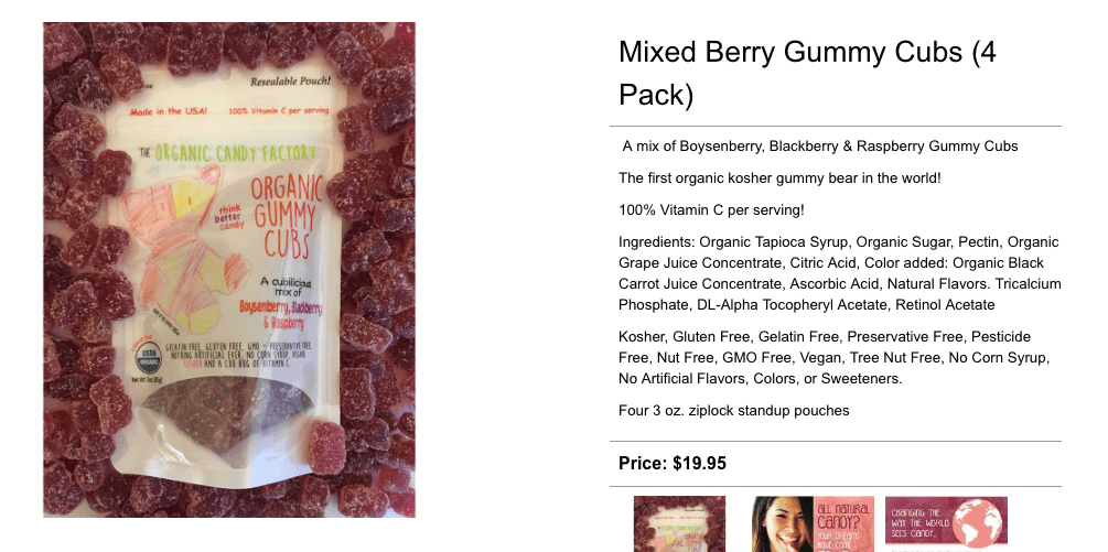
I mean… 👀
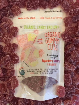
The candy sort of looks old. And stale. And not at all appealing. (My coworker tells me it looks like the package is sinking into a pit of scary, shapeless gummy things.🤷)
I’m fairly certain these photos are trying to convince me to buy from someone else.
Of course, it was easy enough to find someone else. And their photos are telling an entirely different story:

Just look at those lips! 👇

They look seriously juicy. And delicious. And absolutely dreamy.
I want them all. And I want them now.
Two similar products. Two similar vantage points. Two very different takeaways.
See what I’m getting at?
The quality of your product photography makes a statement about your product’s value. 🤩
So what statement are you making?
The difference between a good website and one that establishes a brand as premium boils down to photography (& copy too!).
Your website, both the design and development, are incredibly important elements, but they're also just the container of your store. It’s what it contains that counts!
Because what truly brings your store to life... what makes it breathe... is the content.
Content is one of the most important investments you can make for your company.
Let’s take a deep dive into KinkyCurlyYaki, a beauty company specializing in hair extensions for black women.
Prior to their site relaunch, their product photography (correctly) featured women wearing their hair extensions. While this was definitely the right direction, the quality of the photos lacked a certain, let’s call it... spice, to them.
They were good, but definitely not great:

The style of photography and level of quality did not properly represent the brand’s value and voice. They decided to give their product photography some love before they launched their new site in 2018.
Same product, new look:

How beautiful is she? 👆 How badly do you want to be her right now?
That is the true power of product photography.
So what exactly makes the second photo better?
-
Better composition: In the second photo, the model and product are centered with negative space around them.
-
Better lighting: Her face is properly lit, catching her highlight and giving her a glow.
-
Clean, neutral background: A solid color (whether it's white or a color from the brand palette) allows the product to pop more than the patterned background in the first version.
- Minimal accessories or distracting details: If viewed out of context, the first version could be selling a bracelet.
All of these elements add up to create an image that brilliantly shows off her lucious, beautiful curls - a.k.a. the product.
Carefully defined photographic goals sets you apart 📸
The obvious curse of ecommerce is the inability to touch and feel something before buying it. 🤬
So start by asking yourself, “What questions do customers need answered before they buy?”
Then ask…
How can I show that to customers?
For example:
What’s the texture of this product?
It’s this!


But not this 👇

Can customers imagine themselves using it?
They sure can!
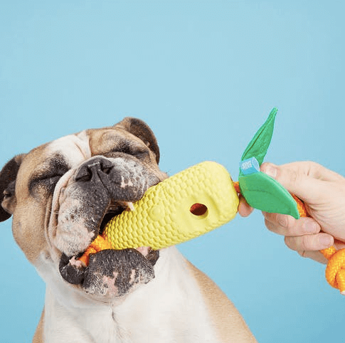
They can even tell how amazing these bowls are:


But theses photos don't help anyone who’s looking to buy a gym bag.👇

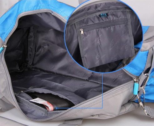
🧐
Sure, I've got a good idea on what it looks like. But will all of my gear fit nicely in here? Can it be organized? Is it durable? Waterproof? And perhaps most importantly...
How does this gym bag make my life better?
Carefully define what you need out of your photography, and you’ll find a focus when it comes time to shoot.
Close the deal with details 🤝
Essentially, content is your biggest sales pitch.
You want customers to imagine themselves using your product. You want them to feel invested in the product. You want to convince them it has to be theirs.
Photography can do that. (If done right.)
The best product photography features multiple photos, from multiple angles. It also shows the desired effect.
Let’s look at Velour Lashes' product page. Their first photo shows the product on it’s own, and then they offer a real-life close-up:


Beautiful! Right?
Now let’s take a look at one of their competitors:

Aside from the eyelashes themselves, the only other product photo is... (drum roll please)
The packaging. 😐

These photos don't show the item in action, none of the desired effect. The competitor did nothing to answer the really important questions.
Zip. Nada.
So you tell me…
All things being equal (price, product details, shipping cost and speed), which store would you buy from?! 🧐
A strategy to stand out 💥
The type of photos you showcase are entirely dependant on your industry. Eyelashes are going to have a different photo strategy than food.
With food, for example, texture and consistency are the burning questions customers have about the product (most of the time).
Is it crunchy like a Nature Valley bar or chewy like a Clif bar?
What are it’s ingredients?
Simply Chocolate shows all of this in one product photo:
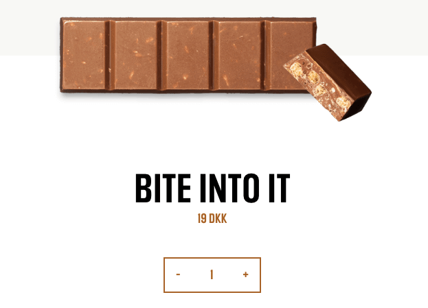
The photo alone tells me this bar is crunchy (thank you peanuts!).
Their competitor, on the other hand, does little to satisfy my curiosity:

That’s why it’s good to scope out what your competitors are doing to see what works and what doesn’t.
Study, and create.
When it comes to content, consistency is key 🗝️
Ok, so we know photos are important.
We know they create an impression, show your product's value and help answer questions that customers have about the product.
So how do you create product photos that drive engagement?
Just as you're investing in your product and your website, it pays to invest in a professional photographer who has experience in your industry and a style that fits with your own.
After designing quite a few websites in our day, we’ve learned that any site that is actually good uses photography that is either:
-
All from the same photographer or studio or…
- From multiple photographers but carefully art directed by a tight set of rules to make it all work together.
These rules are defined by your brand voice and personality (see above).

“I often encourage fresh businesses and startups to put money into quality professional work. It is the consumer-facing representation of your business. If your photos are cheap and amateurish, people will assume your product is the same. You can’t represent a quality product with bad photography.”
Sue Tallon, product photographer
But we’ve found the following general guidelines quite helpful.
-
Sizing: If the photos look pixelated or blurry, it’s likely that the file size that is too small and is being is enlarged beyond its capability.
- Perspective: The lens choice and camera angle can either make your product stand out or look unrecognizable or distorted.
-
Color Tonality: Images shouldn’t look magenta, green or yellow in color. You also don’t want them to be too bright or too dark.
-
Lighting: On that note, bad lighting makes your product look ugly, dirty, or unrecognizable. You don’t want rogue shadows or lens flares that diminish the integrity of the photo.
- Clarity: It’s important to ensure no photos are out-of-focus.
You also want your product images to be uniform in presentation, or it can get puzzling to the eye.
To drive this point across, let’s take a look at an inconsistent, cluttered catalogue:

Are you as confused as I am? 🤔
But look at how much easier it is to look at these collections:
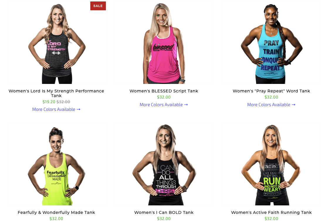

The above images create a unified feeling as you browse the site.
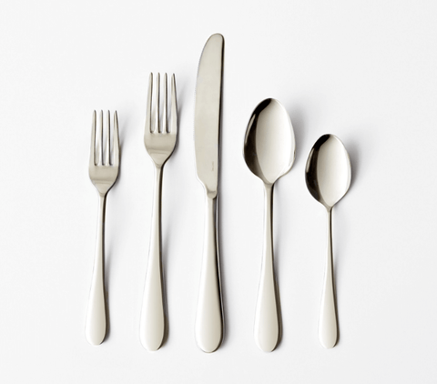
With that in mind, it’s important to create a product photo with enough space around the item so your brilliant web designer can truly work with them to create the brand of your dreams. 😍
With space:
Without space:
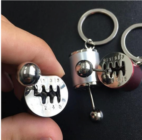
To give a bit more context, extra space allows designers to expand the size of the image and create or match the existing background, which they can use to produce polished hero images and header treatments that appear seamless.
Size matters, so show it off 🐾
The last thing you want to do is deceive shoppers with your photos (chances are your return rate will take a huge hit if you take this approach).
One way to keep it real is by showing the actual scale of the item. It might be subconscious, but this detail is incredibly important to shoppers.
For example, this one doesn’t do that👇

Is this truck too small for my four-year old? Or will it run him over?
Another problem with the toy is that it’s sort of floating around. It doesn’t appear “grounded.” The shadow has been removed, so it’s just hanging out in the middle of nowhere.
It doesn’t even work for drones…

So why would it work for toys?

All of these tiny details can really add up to have a big impact on how customers respond to your product.
Not to mention that some products just don’t photograph well naturally, so you’ll need to get creative (think mashed potatoes as ice cream), as well as make sure the lighting and composition are on point.
This further drives home the importance of investing in a good photographer (or really good gear!) to create product images that are clean, consistent and that use correct lighting.
Photos can be your best friend 👯♀️
As you can see from this article, photography really can make or break a site.
Using the wrong images can harm your brand image. But the right ones create a lasting impression, and make you want to buy that product.
